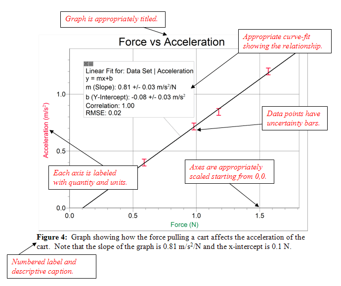
A good graph should have a title, and labels and units on both the x and the y axes. The scales of each axis should allow the data to fit nicely into the graph. If there is a clear trend in the data, you should include a “best-fit line”, a straight or curved line to best fit the data. If the original graph is not a straight line, the data may be manipulated to produce a straight-line graph. This is often useful if the slope and/or intercepts have meaning.
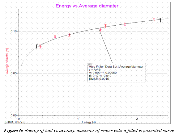
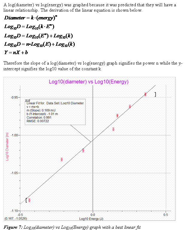
The following example is a good series of graphs used to present the results of an investigation. Notice that the first graph does not give a linear relationship, so the data was manipulated (log of each axis was taken) to give a straight line fit with a slope and intercept which are meaningful.
|
Here is an example of a good graph with the important aspects pointed out.
 |