Example Figures
1. A good use of photographs and illustrations
 |
 |
 |
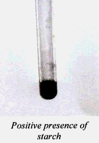
How could this be improved? The quality of the photograph is not very good; it is difficult to see the true color of the test result. The caption is beneath the photograph but it should be labeled. "Figure 2: Positive Presence of Starch". |
These two are well-presented figures. They are clear. Both are labeled and the captions explain what is important for the reader to notice about the figure. | |
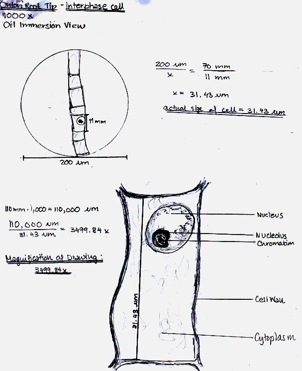
2. Biology Drawings
- A good drawing or diagram needs a numbered label and a caption describing the diagram.
- Main parts in the drawing should have labels and descriptions with arrows clearly pointing out the important aspects.
- Magnification values and sizes of important structures need to be included in microscope drawings.
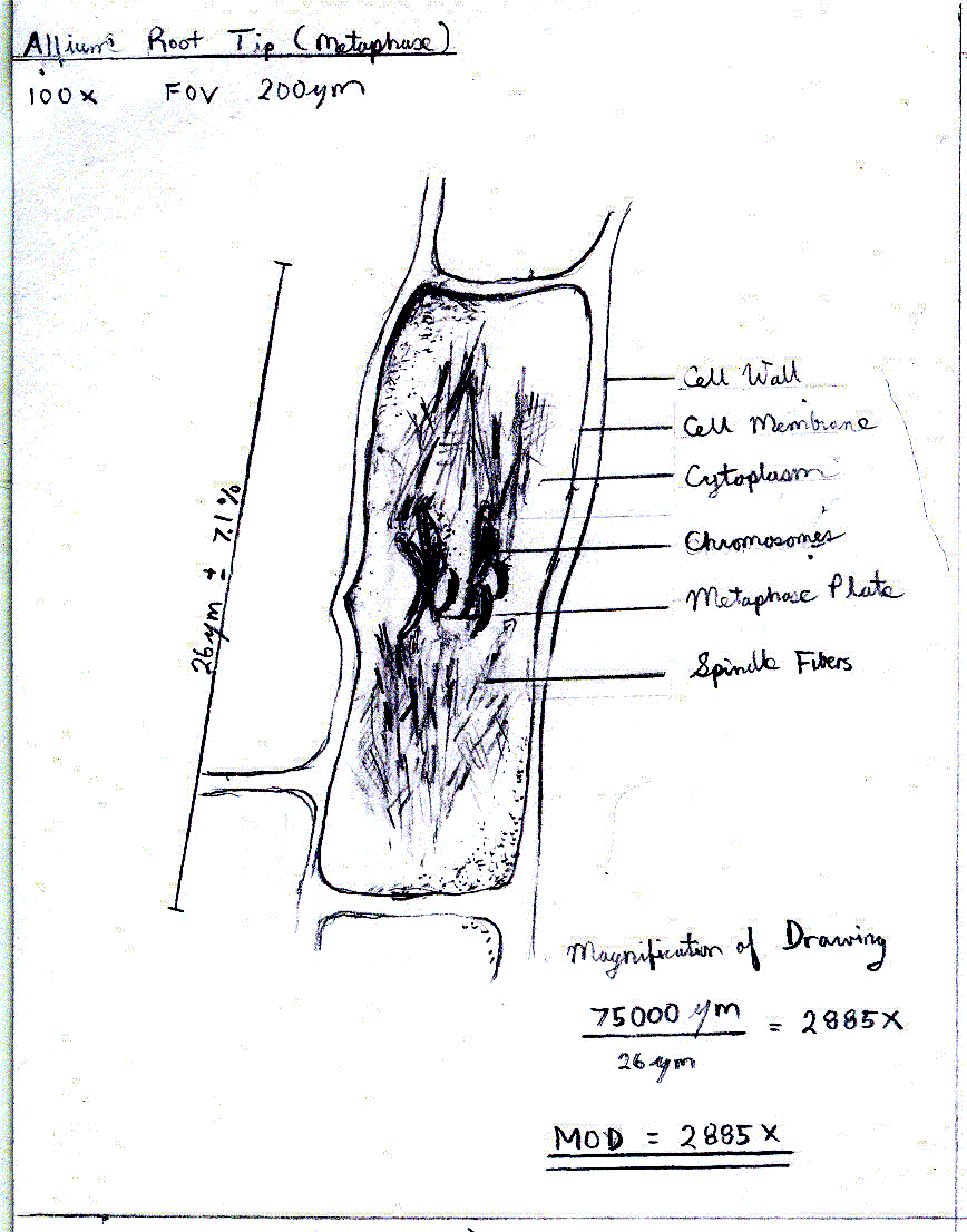
This is a very good example of how to do a biology drawing. Our thanks to ISB student Shivek Bajaj for sharing this with us!
 |
|
|
Another good example of a biology drawing taken from a lab report
on mitosis. An explanation of how the size was determined and how to determine the uncertainty in the size can be found here.
 |
|
|
3. Computer Graphs
Often we use computer probes to collect data for an investigation. Each trial will usually generate large quantities of data from which only one piece of information is extracted. In cases like this, it is best to present the graph from only one of the trials and show how the data was manipulated to extract the information needed.
Here is a good example of a sample graph from an investigation in which there were a total of 12 graphs recorded, one for each trial. The acceleration of the cart in that trial was derived from each graph.
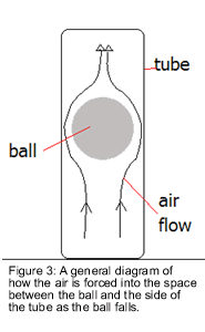
Acceleration from a Velocity-Time Graph |
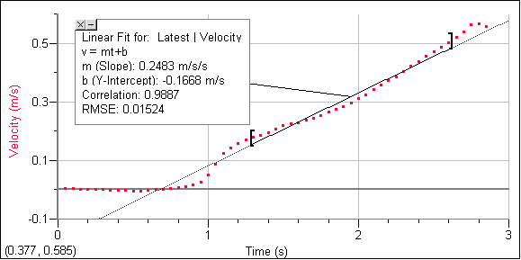 |
| Figure 3: This is the velocity-time graph for the ball rolling down the table in trial 1. The slope of the graph is the acceleration of the ball. |
|
This is an example of a graph showing one sample of how the rate of reaction was calculated in the data table.
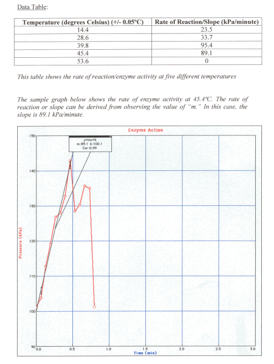
How could it be improved?
|
4. Raw Data:
There are times when you might want to include the raw data as it was recorded
because sometimes it is good to show how the raw data was collected. Including
the “sloppy copy” of your data collection that you actually took
during the lab could do this. This raw data should be included in the Appendix
section at the end of the lab report. It should be titled: “Appendix
1: Sample of Data taken during the Investigation.” You should refer
to this Appendix item in your lab report.
How could this be improved? Add a title and caption at the TOP of the page!