Basic Relationships
Proportional Relationship
If your graph looks something like figure 1, then it is appropriate to propose a proportional relationship between x and y. A proportional relationship has the form y=Ax. It is linear going through the origin. A proportional fit of the data is shown in figure 2. The value of the slope is often related to a physical quantity.
|
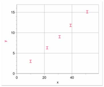 Figure 1 Data showing a proportional relationship Figure 1 Data showing a proportional relationship |
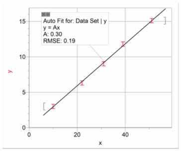
Figure 2 A proportional fit of the data |
|
Back to Top |
Linear Relationship
A linear relationship is similar to a proportional relationship, except that it does not go through the origin. Data showing a linear relationship with a curve fit is shown in figure 3. The slope of the line and the intercept (either y or x) are often related to physical quantities. The intercepts may be positive or negative, depending on the situation. Linear relationships with negative slopes are uncommon. Cases like this are usually some sort of inverse relationship.
|
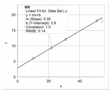
Figure 3 Data having a linear relationship with a linear fit |
|
|
Back to Top
|
Quadratic, Parabolic, or Square Relationship
A quadratic, or parabolic, relationship is quite common. It will look like the data in figure 4. It may start from the origin, or it may not, depending on the situation. A parabola may be fitted to the data, as shown in figure 4. It is usually better however, to re-graph the data as y vs x2. This allows us to present a linear graph, which makes it easier to estimate uncertainties in the constants (slope and intercepts). The data in figure 4 has been re-graphed in figure 5 as y vs x2 and a linear fit has been shown. The relationship is given as y = Ax2 + B.
|
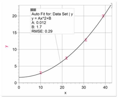
Figure 4 Data having a parabolic relationship with a parabolic fit
.
|
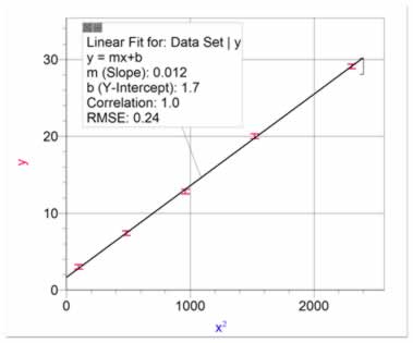
Figure 5 Data from figure 4 re-graphed as y vs x2 to show a linear fit |
|
Back to Top
|
Inverse Linear Relationship
The inverse relationship is often mistakenly fitted with a negative linear fit. A negative linear fit is of the form y= -mx+b, which is fairly uncommon. If your data shows x decreasing as y increases, it is often an inverse relationship, or y = A/x + B. Figure 6 shows data with an inverse linear relationship. As with the square relationship, it is often appropriate to re-graph the data as y vs 1/x, as in figure 7. This allows us to present the relationship as y = A(1/x) + B, and to better estimate uncertainties in the slope and intercepts.
|
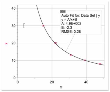
Figure 6 Data with an inverse linear relationship
. |
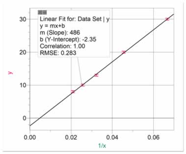
Figure 7 Data from figure 6 re-graphed as y vs 1/x to show a linear fit |
|
Back to Top
|
Inverse Square Relationship
Figure 8 shows an inverse square relationship. Note that it is difficult to distinguish between an inverse linear and an inverse square relationship just by looking at the graph. The data in figure 6 and figure 8 look very similar. This is another reason to re-graph the data as y vs 1/x or 1/x2, so that you can distinguish between an inverse linear and an inverse square relationship. Figure 9 shows the data re-graphed as y vs 1/x2. This allows us to present the relationship as y = A(1/x2) + B, and to better estimate uncertainties in the slope and intercepts.
|
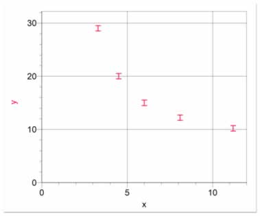
Figure 8 Data with an inverse square relationship |
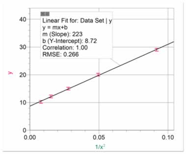
Figure 9 Data from figure 8 re-graphed as y vs 1/x2 to show a linear fit |
Back to Top
More Advanced Relationships
As you continue to investigate more sophisticated phenomenon, you will encounter more sophisticated relationships. Here are some of the relationships that are more commonly found in complex scientific research.
|
Power Relationships
Sometimes, in complex situations, x and y will be related by a power not equal to 1 or 2 (linear or square). If this is the case, a power fit may describe the relationship. A power relationship is of the form y = AxB.
If the relationship is a power (B in the preceeding equation) greater than 0, then we call it a direct power relationship, and the data will trend upward. If the power is greater than 1, the data will form a positive (upward) curve. If the relationship is a power between 0 and 1, then we call it a root relationship, and the data will form a negative curve. If the relationship is a power less than zero, we call it an inverse power relationship.
As in other cases, it is best to re-graph the data to show a linear fit. Note that this may only be done when the data goes through the origin. In these cases, a (log y) vs (log x) graph will be linear. This can be shown to give a graph of the form (log y) = B (log x) + (log A). The slope of the (log y) vs (log x) graph will be the power, and the y-intercept will be (log A). As before, this allows a more precise determination of the constants A and B and their uncertainties.
A direct power relationship will give a (log y) vs (log x) graph with positive slope, while an inverse power relationship will give a (log y) vs (log x) graph with a negative slope.
Figure 10 shows data for a direct power relationship of power greater than 1. Figure 11 shows the (log y) vs (log x) graph. The relationship which can be derived from figure 11 is: y = 0.38 x3.0 , where 0.38 is the antilog of -0.47 .
|
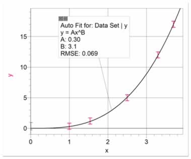
Figure 10 Data with a power relationship greater than 1. A curve has been fitted of the form y = AxB. This is more appropriately presented as a (log y) vs (log x) graph as shown in figure 11.
. |
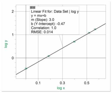
Figure 11 Data from figure 10 re-graphed as (log y) vs (log x) to show a linear fit with positive slope greater than 1. Note that, in the equation y=AxB , the slope of figure 11 equals B and the antilog of the y-intercept equals A. |
|
|
Figure 12 shows data for a direct power relationship with power less than 1, or a root relationship. Note that for low powers (4th root or less), it is easy to mistake a linear fit for a power fit. If the curve is expected to start from the origin, it is likely to be a root fit, rather than a linear fit, which would have a non-zero intercept. Figure 13 shows the (log y) vs (log x) graph. The relationship which can be derived from figure 13 is y = 15.8 x0.25 , where 15.8 is the antilog of 1.2 .
|
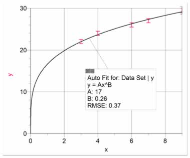
Figure 12 Data with a power relationship less than 1. A curve has been fitted of the form y = AxB. This is more appropriately presented as a (log y) vs (log x) graph as shown in figure 13. |
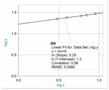
Figure 13 Data from figure 12 re-graphed as (log y) vs (log x) to show a linear fit with positive slope less than 1. Note that in the equation y=AxB, the slope equals B and the antilog of the y-intercept equals A. |
|
Back to Top
|
Subtractive Power Relationship
Occasionally, you will encounter a situation where y is reduced by a factor which is subtractive rather than multiplicative. This may be found in situations where a drag force on a pulled object increases with x. In these cases, a curve of the form y = A - BxC is likely to give a good fit, as shown in figure 14. It is usually acceptable to leave the data in this form, as re-graphing it in linear form is difficult.
|
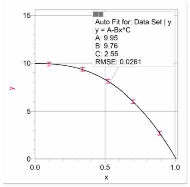
Figure 14 Data with a subtractive power relationship. A curve has been fitted of the form y = A - BxC. |
|
|
Back to Top
|
Exponential Decay Relationship
Exponential decays are a common relationship in science. It is predicted when y reduces by a given proportion for a given increase in x, and when y approaches an asymptote as x approaches infinity. Figure 15 shows an exponential decay with a curve fit. If the asymptote (B in the curve fit in figure 15) is expected to be zero, then the data should be re-graphed as ln y vs x, as it results in a linear fit, as shown in figure 16. The equation from figure 15 is ln y = -0.751 x + 2.84, which can be manipulated back to the form y = A*e(-Cx). The final equation is y = 17.1*e(-0.751 x), where 17.1 is the inverse natural log of 2.84.
Note that an exponential decay looks similar to an inverse relationship, but when y is graphed against (1/x), a proportional fit will not fit the data.
|
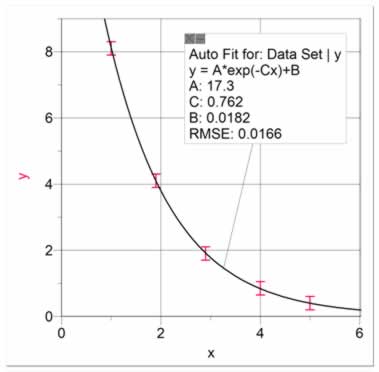
Figure 15 Data showing an exponential decay |
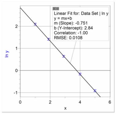
Figure 16 Data from figure 14 re-graphed to give a linear fit |
|
Back to Top
|
Inverse Exponential Relationship
This relationship is expected when y approaches a maximum limit as x approaches infinity. It can be modeled as y = A(1-e(-Cx)) + B. Data showing this relationship approaches an asymptote (A+B), as shown in figure 17. An inverse exponential curve is fitted to the data in figure 17. It is difficult to manipulate the data to present this as a linear graph. It is acceptable to present the data in this form.
|
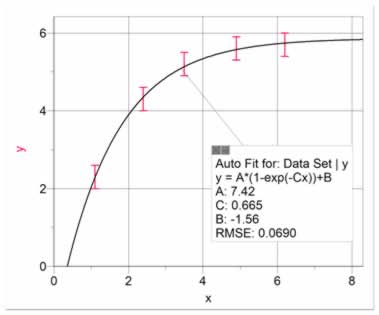
Figure 17 Data showing an inverse exponential relationship, approaching an asymptote. |
|
|
Back to Top
|
Uncertainty in the Slope and Y-Intercept of a Linear Fit
In cases where you can present your data with a linear fit, it is important to estimate the uncertainty in the slope and y-intercept. For example, figure 18 presents a set of data fitted with a best linear fit. The slope is 6.3 and the y-intercept is 1.7. But what is the uncertainty in these values? To determine this, we use what we call High and Low Fits. The High Fit means that we manually fit a line so that it has the highest slope possible while still staying within most of the uncertainty bars, as in figure 19. The Low Fit means that we manually fit a line so that it has the lowest slope possible while still staying within most of the uncertainty bars, as in figure 21. Notice that the y-intercepts also cover a range. It is usually best to present both High and Low Fits on a single graph, as in figure 21. Using figures 18 and 21, it can be seen that the equation best describing the data is y = (6.3 ± 0.7)x + (1.7 ± 0.4).
|
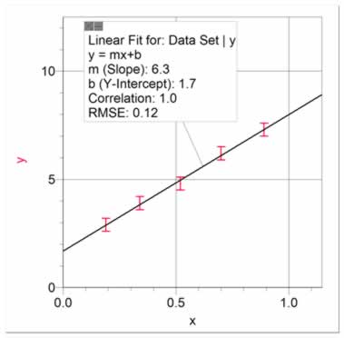
Figure 18 Data showing linear relationship with an automatic fit showing slope of 6.3 and y-intercept of 1.7. |
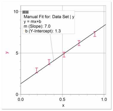
Figure 19 The fit with the highest possible slope, just within the uncertainty bars, showing the highest possible slope of 7.0 and the lowest possible y-intercept of 1.3. |
| |
|
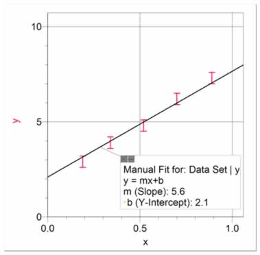
Figure 20 The fit with the lowest possible slope, just within the uncertainty bars, showing the lowest possible slope of 5.6 and the highest possible y-intercept of 2.1.
|
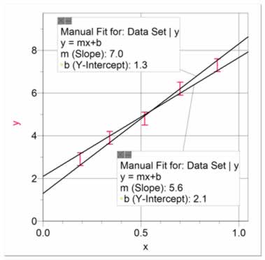
Figure 21 The fits with the highest and lowest possible slopes, presented appropriately on a single graph. The range in the slope is 1.4, for an uncertainty of 0.7. The range in the y-intercept is 0.8, for an uncertainty of 0.4. |
| |
Back to Top
Close this window when finished
|